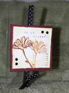
Here is the clear card I promised to post. It really bothers me that clear cards don't scan well or show up nice in a picture because they are so cool in real life! If anyone has any tips for photographing them be sure to tell me.
To make this card I cut a rectangle out of a piece of typing paper. I inked up my script background stamp with staz-on ink and set the typing paper (with a rectangle hole) on top of the background stamp, then placed the clear card on top of that. It is very important to use staz-on ink for this because it is permanent and won't rub off.
The image layer has weathered BG in Creamy Caramel. The flowers are done with So Saffron and Bravo Burgundy. The edges are sponged with So Saffron to give a softer look. The words are stamped with Karen Foster Snap Stamps (1/8 inch casual). I used pop dots to adhere the layer to the clear card.


3 comments:
I think the card would photograph better with a neutral backgrund...like white or black. The green fuzzy blanket or whatever isn't working. Cute card though. I like clear cards also. I really like the polka dot ribbon you tied around it
great card - love how clear cards look! of course, need to try one myself sometime soon!! :)
I am all over this card! Now this is on my to do list... I think I am going to try something with the double sided papers... Thanks for the inspriration!
Post a Comment